Your Ad Here

2012 disaster scene break down


2012


Hey guys, want to know how to create (visualize) the disaster scene in 2012 ? here we go..

Roland Emmerich, the director, froze New York City in The Day After Tomorrow and blew the White House to bits in Independence Day. So he wasn't sure about directing 2012. The movie is based on the idea that the end of the Mayan calendar on December 21, 2012, portends a global apocalypse. "When I realized how much disaster was involved, I got a case of cold feet because I've done that, you know?" he says. "So I said, 'Okay, I'm going to make this the mother of all disaster movies.'?"

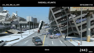
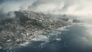
More than 100 artists created 2012's 1300 visual-effects (VFX) shots, including volcanic eruptions, tsunamis, floods—and a massive earthquake that rips California apart. In this three-minute sequence, failed science-fiction writer Jackson Curtis (John Cusack) drives through Los Angeles as the city crumbles around him. In the past, Emmerich might have filmed on location and swapped in CG crumbling buildings, but that approach didn't make sense for 2012 because every edifice had to be destroyed. Instead, artists at the VFX company Uncharted Territory built a 3D photorealistic version of several city blocks using 60,000 high-dynamic images as a reference. Then they made every mailbox, tree and building shake and crumble.

As animators molded the virtual city, Emmerich was filming his actors in front of a blue screen. He put the actors on a "shaky floor," an 8000-square-foot steel platform on airbags. Special-effects coordinators jiggled the bags with pneumatic pumps to inspire authentic reactions from the actors. "It was the most complicated scene we created," Emmerich says. "And it's one of my favorites." Below, Marc Weigert and Volker Engle, co-CEOs of Uncharted Territory and visual-effects supervisors on the new movie, explain how they put the apocalyptic effects together.

STORYBOARD & PRE-VISUALIZATION
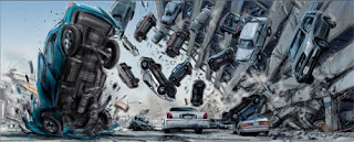


Every sequence in the movie begins as a storyboard, or a rough, comic book–like version of the film's action. This particular sequence, which depicts Curtis Jackson (John Cusack) rescuing his family and driving them to the Santa Monica airport, lasts three minutes and was initially just "15 to 20 quick drawings," says co-VFX supervisor Volker Engle.

After the storyboards are done, VFX artists move to a stage called pre-visualization. "I describe it as an early form of a CG version of a sequence, with video-game quality [visuals]," Engle says. A crude version of the action, pre-vis includes every part of the scene, up to camera angles and early sound effects. "I think that's really the future of filmmaking," says co-VFX supervisor Marc Weigert. "That almost every movie will be entirely done in the computer first so you can find out if a scene will work before you shoot it. Every shooting day is extremely expensive—about $300,000. So if you can spend fairly little money compared to that to actually build all this first in the computer, edit this, find out whether there is anything you don't even need to shoot because, you know, it doesn't work anyway in the movie."

LIVE ACTION SHOT
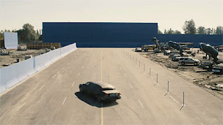


Director Roland Emmerich shoots the limo against a massive blue screen in Vancouver, Canada. The shot, called a live action plate, looks like this before any virtual elements are added; Emmerich filmed the scenes with a Panavision Genesis digital camera

After Effect Tutorial (Glowing Vector)

Glowing Vector

We all seen these cool looking organic smoothly growing elements in many TV ads and pretty much any graphics design. Even though there are pre-made libraries of these elements available it's a good exercise to learn how it's done and learn a few new techniques in AfterEffects.

Here is an example of what going to be creating in this tutorial:


To start with open your Adobe Illustrator or as a matter of fact any other vector based application ( I use Illustrator only 'cause it gives me more flexibility compare to others and I just get used to it). If you don't have Illustrator the same result could be achieved in Photoshop for instance. Basically the goal in our first step is to create a design of a flourish we will be animating. I happens to have a Corel clipart gallery ( which is a quite a few years old and somewhat outdated) which has tons of these cool looking organic element and they all are pretty much ready to go with some tweaks. Some freeware font profide a good source of these elements as well. If you plan to create something really unique - there is always a pen tool available - just draw whatever shape you need. I'm not going to go into the details on how to use Illustrator. The goal here is to have all the elements of your design which would be animated on saparate layers. We will use these layers in AfterEffects to complete our animated flourish. Make sure you use a document size at least the size of your future project in AfterEffects. I use 4096x3112 pixes only 'cause it will give more flexibility at the end and you can freely scale elements without worrieing about quality degradation.


As you can see on the picture above I have the flourish broken down into 5 layers and named them in order I plan to animate them. Save it as Adobe Illustrator document (.ai file). The first stage is done.

In the end the flourish should be white with alpha channel. You can either change its color from black to white in Illustrator of apply an Invert filter in AfterEffects

Now it's time to open AfterEffets. Double click in project pane and import your freshly created flourish in as a composition. Open newly create comp and adjust its size to be a bit bigger than the actual design - we would need a bit of a space for these cool looking easy-ease bounce effects for some elements. Changea comp's frame rate to 90 frames per second.

High number of frames per second will help you down the road if you want to slow down your flourish. For instance you can slow down 90 fps animated element up to 4 times without any quality degradation!

Now the fun part. Using "Pen tool" draw a line which loosely follows a shape of an element in a layer you plan to animate:


Apply a stoke effect to the first layer. Make sure you have path selected under a path property. Change brush size to cover you shape. Spasing set to 0%.

There is an unfortunate limitation of a stroke effect - brush size can't be bigger than 50 px. In other words if your shape is thicker than 50 pixels you can't cover it using one brush stroke. Luckily you can use multiple strokes to cover an element of any size. Just make sure under path property you have 'All path" selected and "Stroke Sequentially" is unchecked.

Change paint style to 'Reveal Original Image" and animate an end property from 0% to 100% over a period of time (click stop watch at frame 0 and set end property to 0%, advance a few frames and set end property to 100%).

Now lets add some easy-ease and bounce elements. In my previous tutorial I've explained how to create a realistic bounce effect. We will be using the same technique here as well. The expression I've used there was not perfect and here is a revised version that works better:

freq =4;
amplitude = 20;
decay = 4;

s = amplitude*Math.sin(freq*time*2*Math.PI)/Math.exp(decay*time);
scale + [s,s]

Apply the above expression to a scale property (option click on stop watch and copy/paste the expression) of the element you plan to grow and easy-ease bounce:


Repeat the above steps for all the layers you've desided to animate and render the comp out. I use PNG compression with alpha channel to reduce the resulted file size of the animation. And there you have it - your first animated organic glowing element.

Batman Arkham Assylum


BATMAN ARKHAM ASSYLUM


On the art side our process began with us scouring the graphic novels for inspiration. We looked at the Batman comics down through the decades paying close attention to the Arkham specific books like the beautiful 'Arkham Asylum: A Serious House on Serious Earth', and 'Arkham Asylum: Living Hell'.

Arkham had never been visualised in its entirety before so the environment team had the big challenge of creating every nook and cranny of the island for the first time. Arkham Asylum is an amazing place to set a Batman game. It gave us not only an environment, that from a technical and game play standpoint was suited to our design, being of a finite, contained size with believable borders, but it also gave us a setting so rich in creepy, foreboding atmosphere that it was an artist's dream location.

The Art Director Dave Hego had a very strong vision that Arkham should be like a living breathing character in itself that changes as time passes, that slips from dark reality to darker nightmare as Batman slides into the Scarecrow sequences, and that evolves as The Joker's plan unfolds.

Arkham is an island with a history and its buildings reflect this in the way they have been adapted over time to suit the needs of the Asylum, the architecture of one era juxtaposed with that of the next. This layering of architecture creates the richness and uniqueness you see in the game, from the Gothic architecture of the Main Hall, to the Victorian style of the glasshouses, to the dingy industrial warehouse feel of high security.

"We tried to use real places where possible as reference for our environments," explains Dave Hago, "an example of this being The Arkham Botanical Gardens which are inspired by the Palm House at Kew Gardens in South London.
The environment team spent time there gathering reference material in the beautiful Victorian glasshouses. We found this type of exercise invaluable in creating highly detailed environments that had a feeling of authenticity. We also used Alcatraz the real world equivalent of Arkham as another source of inspiration."

-Rocksteady-

Preview :


Do You Know ? (3D modelling)

3D Modeling is the creation, manipulation, and storage of geometric objects to represent objects that are all around us or virtual objects. The process of 3d modeling begins with the use of specialized 3d modeling software. The 3D artist develops a mathematical, wireframe representation of the object using specialized software. The final product is called a 3d model.

The 3dmodelling process for 3D computer graphics is similar to sculpting. During this process geometric data is manipulated and prepared manually or automatically. There are three methods for creating and representing a 3d model. They are: polygonal 3d modeling, NURBS 3d modeling, and Splines and Patched 3d modeling.

Polygonal 3D modeling uses vertices that are connected to form a polygonal mesh. Because they are polygonal, curved surfaces are approximated by using many small flat surfaces. The vast majority of 3D models today are built as textured polygonal models, because they are the most flexible and quickest for the computer to handle. Polygonal 3d models can be categorized as high polygonal and low polygonal models depending on the density of the polygonal mesh. Low poly 3d models are preferred for 3d games and simulations as they tend to require less computing power.

NURBS 3d modeling uses NURBS surfaces. NURBS are truly smooth surfaces, not approximations using small flat surfaces, like polygonal 3d modeling. They are best suited for complex forms and organic modeling. NURBS surfaces are defined geometrically by spline curves, which in turn are influenced by weighted control points. The curve follows these weight control points, so increasing the weight of a point will pull the curve closer to that point and vice-versa.

Splines and Patches 3D modeling depend on curved lines to define the visible surface. When using this method the 3d modeling stage consists of shaping individual objects that are later used in the scene. There are a number of techniques including: constructive solid geometry, implicit surfaces, and subdivision surfaces.

Modeling can be performed by means of a dedicated 3d modeling software program or an application component or some scene description language. In some cases, there is no strict distinction between these phases; in such cases modeling is just part of the scene creation process.

Complex materials are modeled using particle systems. A Particle system is a mass of 3D coordinates which have points, polygons, texture splats, or sprites assigned to them. Materials that are modeled using particle systems include smoke, blowing sand, clouds, and liquid sprays.

Once the 3d model is done, the 3D artist may begin the process of 3D rendering for visual representation in 2D or use the 3d model for an animation. Also, the 3D model can be used for other applications including computer simulation of physical phenomena. The 3d model can also be physically created using 3D printing via rapid prototyping techniques. When 3d printing is used, the 3d object is created connecting layers of cross sections of material.

How to do mindmap ?

First thing first. . I like that quote :)

Have you ever heard of mindmap before ?
yes or no, i don't really care 'coz i just want to share..

Before you ask how can you to be creative ? how can you create something innovative ? You can start with mindmap.

Mindmap is often used to generate ideas from our brain onto a scarp of paper, basically that's what called by mindmapping. By doing so, we generate our ideas in our brains and turn it into writing object ( we write it down ) and that's proven to be efficient to make unthinkable keywords, yet innovative !

How to do mindmapping then ?

Take a pen and an A4 paper (you can try bigger one later on). Start thinking of your keyword which you want to break-it-down, e.g : "Your Name". Mindmap always start with a simple keyword in the middle of your page and then you need to elaborate (stereotyping) that keywords untill it has branches, yes a lot of branches, noun or adjective.

To make it simple, stereotype is our way of linking "something" with "something else", e.g :

A burglar. He watched his target's house for couple days. This burglar was thinking to take something valuable inside, and he started to think, how can he enter the house ? It can be from windows, picking the door's lock, from the rooftop, etc. And how if someone in the house see him ? he could kidnapped him/her for money, he could smack them, etc.

Now that IS what you call by "STEREOTYPING", it refers to the process of thinking, the way he linked from one keyword o another keywords, and so on..

Mindmap is done by doing stereotype to your existing keywords. Now back to your job. You have your own name on the middle of an A4 paper, do stereotyping from your name, e.g : your age, your address, your wife/husband, your hobby, your car, it can be anything that related to you for the very first place. After that you need to elaborate those keywords and keep doing so untill you have a lot of branches, a lot of keywords. Even our brain, it stores a lot of infos and if you write it down, even this mother earth isn't enough to write on. That is us, human ! Yay !

here are some samples of mindmap :


Secondly, if you now know how to do mindmapping, how do you apply it to your design, to your needs ?

Well, it's simple, since you have mindmap a keyword and elaborate it into thousands, you need to look WHAT unique keywords you have and you can take a note on those unique keywords you find, and from there, it's up to you on how to make use of it, can be switched, can be re-arrange, etc untill you find something usefull and unthinkable from there !!

P.S : - If you have done with filling up an A4 paper without any single space, you can try a bigger size paper :) - Mindmapping is placed in pre-production stage, where you generate ideas, write a story, etc Have a try !!

SFX is important !

Sound Effects are present in almost every media that you see and hear on a daily basis. From television, movies, and shorts to web sites, and digital music sound effects help tie the pieces together for your brain to understand. Their importance can easily be measured by their absence, when our minds quickly pick out the inconsistency.

Our brains rarely just think on one sense. Most often several of our senses make up the contents of every moment in our perceived time. We see a gun, we watch it fire, but if we don't hear the gunshot we feel that the experience is somehow broken, fake, or just doesn't make any sense.

This is why good quality sound effects can come in very handy. Having the exact right sound for your images can be crucial in getting your audience to become completely engulfed in the experience. Sometimes the sounds can be isolated or symbolic, like the ceiling fan in the beginning of "Apocalypse Now". Much of the other sound effects are removed to focus on the ceiling fan, which is a combination of blades moving quickly past the microphone, and the blades of a helicopter. The symbolism here is that the whirling blades of the fan are reminding Capt. Willard of the call of the jungle.

Sometimes the sounds are a little more collaborative and are mixed together to make a scene sound realistic. Sounds of leather coat, mixed with the jingle of change in the pockets, laid over the sound of a busy airport can create the unconsciously expected realism that your brain is expecting.

But you'll never get lucky enough to find a prefabricated sound byte that has everything you need laid into it at exactly the right time. That's why clean, individual sounds are vitally necessary to create the feel that you'll need. In this way you can mix and match a multitude of various sounds together to create completely new sounds, or a series of orchestrated sounds that complete a collage.

Montage theory (at least one of its aspects) employs juxtaposition of images in order to create new meaning. For example: Show a black and white picture of a sad looking old man, and then show a picture of an empty bowl. Most often our brains put the images together and tell us "this old man is starving". When in reality the two images have nothing to do with one another. The same thing holds true for sounds, especially when they are blended with images. An obviously imaginary bolt of magic blasts out of a character's fingertips, we hear some burning lightening magic sound, and suddenly we are immersed in pure fantasy; believing that this person is really able to shoot magic from their fingertips. The icing on the cake, the thing that sells it, is the sound.

The importance of sound in your production is paramount. Cheap sounds pull your audience out of the realism of the experience. This is why high quality sounds should be collected at any price. Good well made sound effects will pay for themselves, though they'll never make their financial contribution known. It all comes down to the final product. Does it immerse your audience? If not then maybe some tweaking and enhancement of your sound is exactly what's missing.

HOT NEWS !!


For 3D artists, there's a hot news, especially to those who wants a lesson for designing robots, there is GNOMON ROBOT DESIGN DVD. With this, you can learn how to create a high-rank robot models, but of course, i encourage you to buy the original, because it's worth it !

here are a few screenshots :